What the best No-code products do right, and why it’s not about code.

I've learned a lot about product design over the last three years of working on our website builder product. When starting out, most of my product decisions were based on intuition. I wasn't sure what the product should look like, what features to add, and which ones to cut.
With practice and experience however, some common themes started to emerge and things got easier. I developed a mental framework for product design decisions. For a long time these ideas have only existed in my head. I've finally been able to put these ideas into words and wanted to share them with you.
These ideas apply especially to no-code tools such as Umso, but could also be applied to most other software products. If you're at all interested in product design, user experience or no-code tools, then you will hopefully enjoy this read.
What's No-Code?
No-code tools are getting more and more popular. They allow anyone to create websites, applications, and automations, which could previously only be created by experienced programmers.
Not having to know code is a major advantage of these tools, but a good no-code tool doesn't just replace code with a pretty user interface. Code is very flexible and complex. If we tried to match that power with a no-code tool, we'd quickly run into trouble.
Designing a no-code tool
Let's have a look at what happens when we try to replace code with a user interface, the problems we will run into, and how to fix them. To do this, we will design a simple no-code tool for building websites.
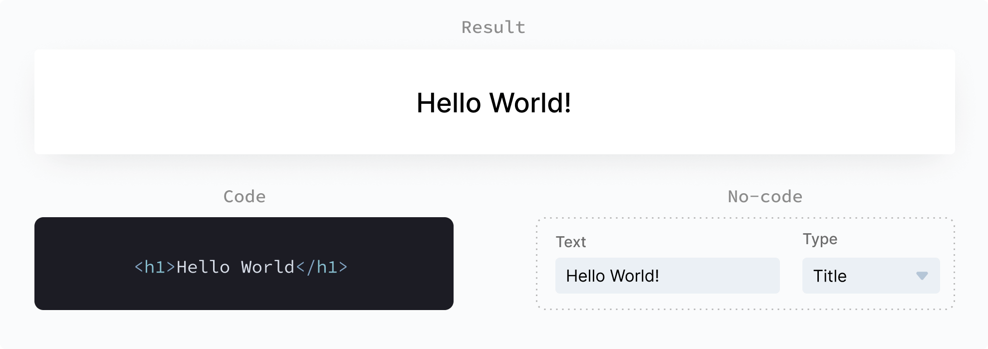
So far, so good. The graphic above shows the code and the no-code approach to displaying a simple text. Instead of having to know the HTML syntax for a title, the no-code UI lets you type in your text, and select a text type from a dropdown menu.
Now let's talk about something you can't see in the example above: flexibility. With the provided UI, you can not change the color, position, background, or any other aspect of the text. How boring!
In this next example we will add some more settings to our no-code UI to make our website title a bit prettier. The code column has also been updated to reflect those same changes.
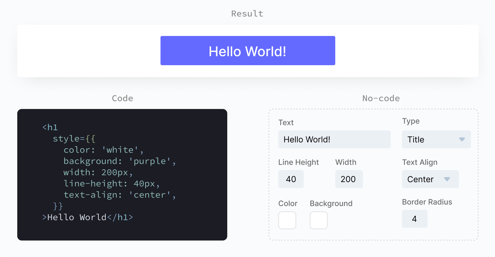
Things are starting to look a little more complicated. We’ve got 8 lines of code and 6 UI inputs, all for a little box with text. The settings now allow you some more creative freedom but are still very limiting.
Before we make things even more complicated, let's talk about optimizing the UI.
You could argue that my design isn't great, and you'd be right! Settings could be grouped differently or hidden by default. There could be a better visual hierarchy.
However, no matter how you organize the UI, there is one thing you can't change: you can not remove any of the options without making them unavailable to the user. Even worse, if we want to change more parameters, we need more input fields. That can quickly get out of hand and it wouldn’t be any fun if I didn’t show you.
When our No-code falls apart
People who use our no-code tools expect useful and beautiful results. We need to give them the option to create more complex layouts, apply more styling and use different design elements. Let's give the people what they want!
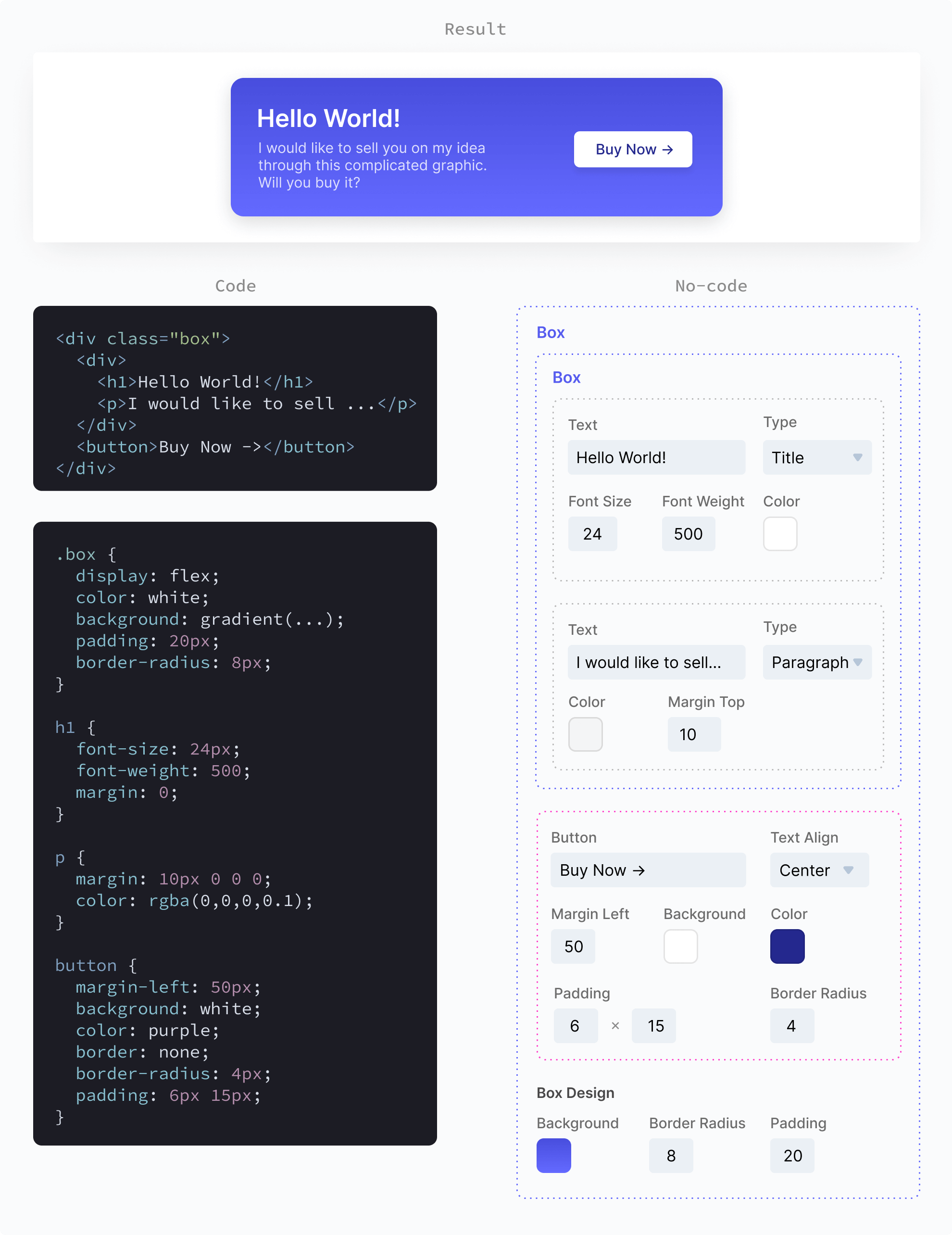
Oh my, that's a bit though to look at. Our UI has quite a lot of options now for such a little box. What would this look like if we had an entire website to design? What about all the design options that aren't even available in this UI?
As you can imagine this wouldn't end well if we kept going with our current approach. Our customers want better results, which require more design options. More design options will cause a more complicated UI. We simply can't match the flexibility of code with our UI. So where to we stop, what do we do?
How no-code succeeds.
The easiest way to create a better UI is by limiting the parameters a user can control. However, the more limits we impose, the harder it will be to create high-quality results.
Since we don't want to jeopardize the quality of outcome with our limitations, we can apply a common programming approach: abstraction. We can pre-create common elements which can be modified through limited parameters.
When we create these abstracted elements, we need to make some decisions on behalf of the user. For example, we might decide what technology is used to achieve a certain effect. This will be something the customer can not control. In the programming world, we call this opinionation.
It can be hard to know which things to limit and which to allow, what to abstract and how to implement it. That's where our super-power comes in: knowing the customers goal.
Instead of trying to find out what the customers goal is, we can design our no-code product with a specific goal in mind and then let the customers come to us. Umso, for example, is marketed as "the website builder for startups". The goal of our customers is to create a typical startup website.
The more specific your goal is, the easier it will be to build a good no-code solution. If you have a no-code product with no specific goal in mind, then this approach won’t work for you.
In conclusion, a good no-code product uses Goal-oriented Opinionation, Abstraction and Limitation: GOAL. Let’s see what that looks like in action.
GOAL UI
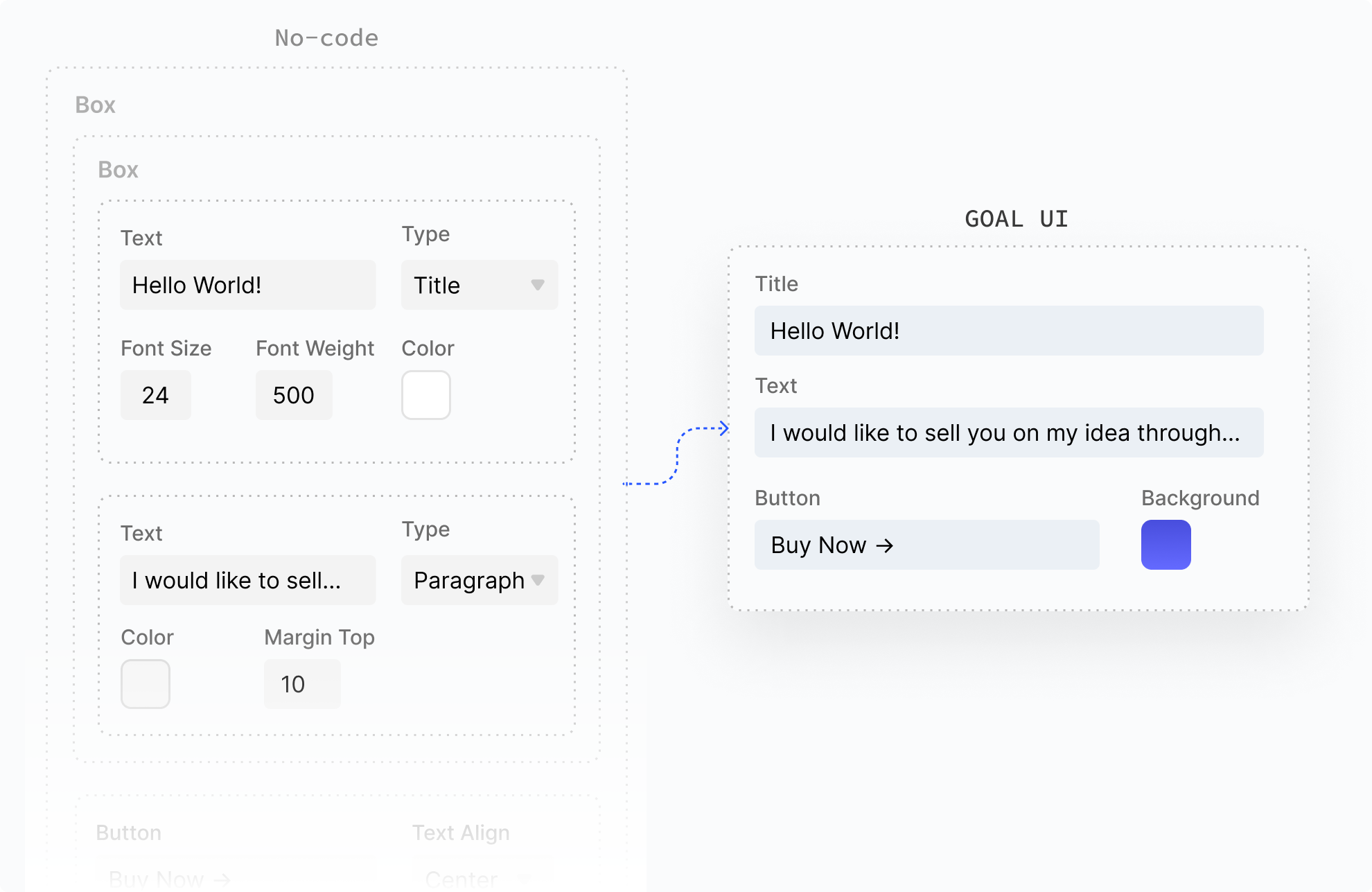
This is what no-code looks like at its peak. We turned 22 input fields into 4 and got the same result. With this UI, you can create the same design as above, but without the hassle.
You can't create anything else with it and that's ok. For each new common element on a website, we can create a new GOAL UI. Because we know what our customers want to achieve, we won't need too many.
GOAL, the No-code Code
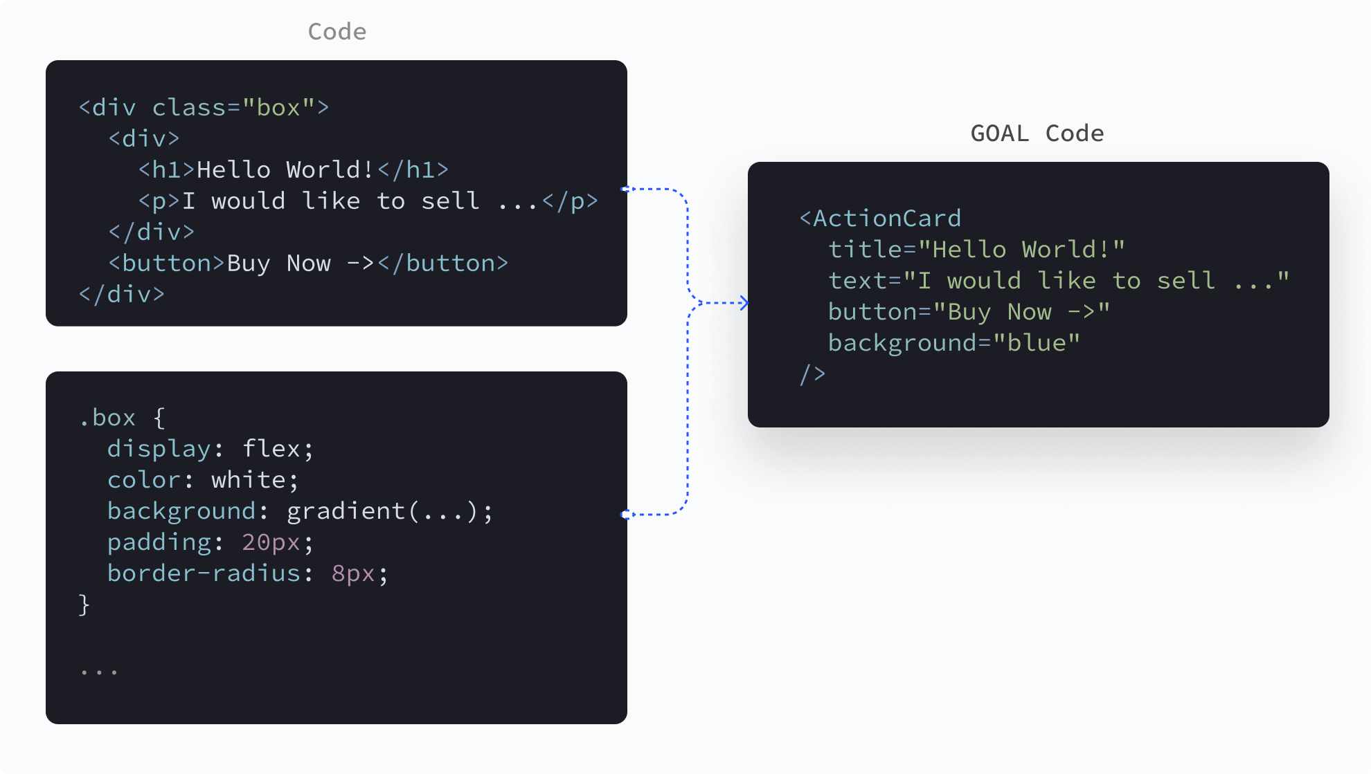
Yes, that's an oxymoron, and it works well to prove the point. We can apply the GOAL principles to code as well. Even if you're not a programmer, you can see the difference.
Our code on the right side is short and sweet and helps programmers in the same way it helps no-code users. In fact, this approach is very common and programmers use their own and third-party GOAL code all the time.
Summary
The example below shows the GOAL approach with both code and a UI. Both approaches look really similar here, and very different from their previous versions. That’s why it’s not about code. It’s about meaningful goal-oriented, opinionated, abstraction and limitation.
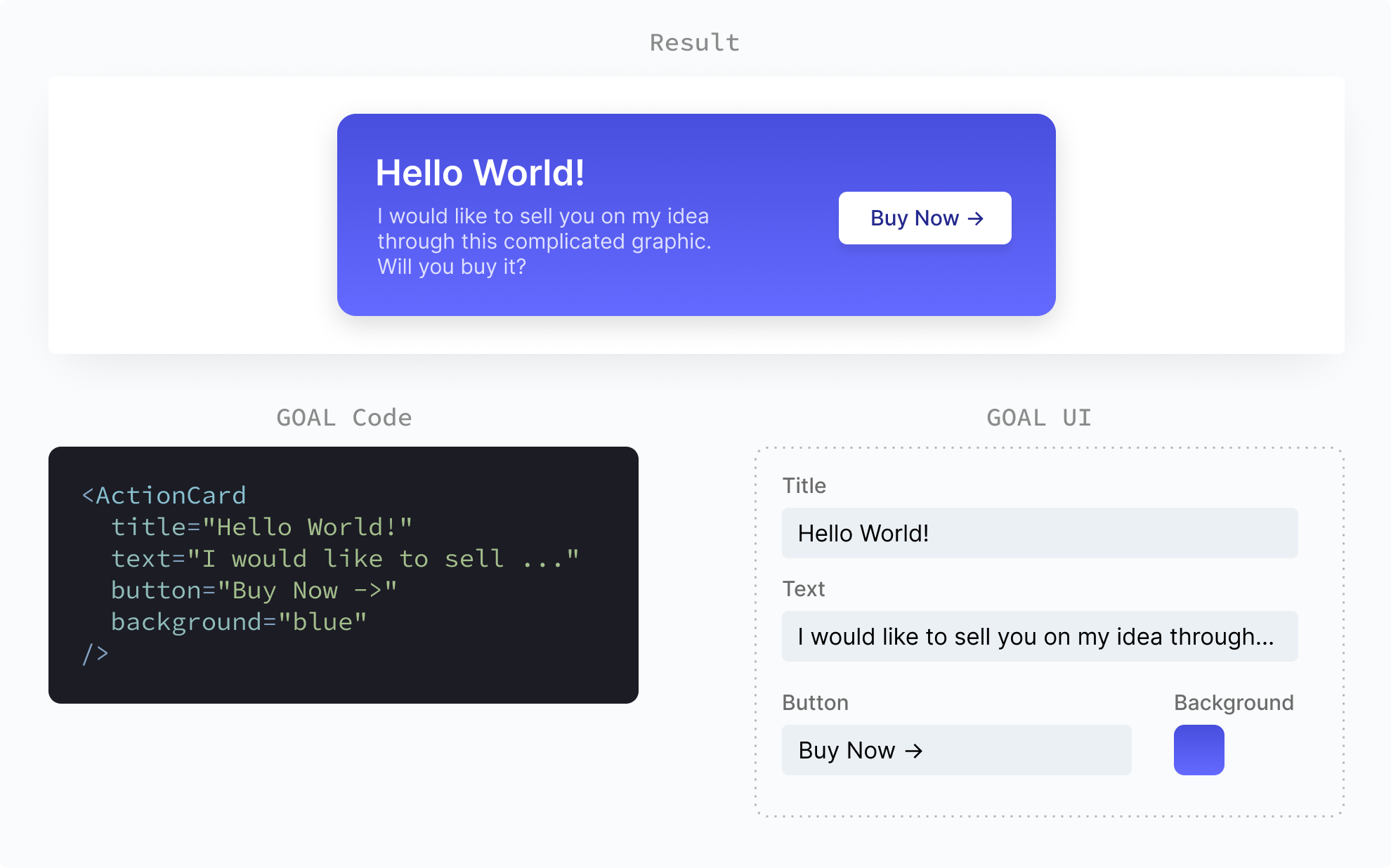
This concludes our little journey. Please keep in mind that neither the code nor the UI are perfect and only serve as visual guides. This approach has worked for us but certainly isn't the only one. No code was harmed in the making of this blog post. Thanks for reading.